Network Rail Pictograms
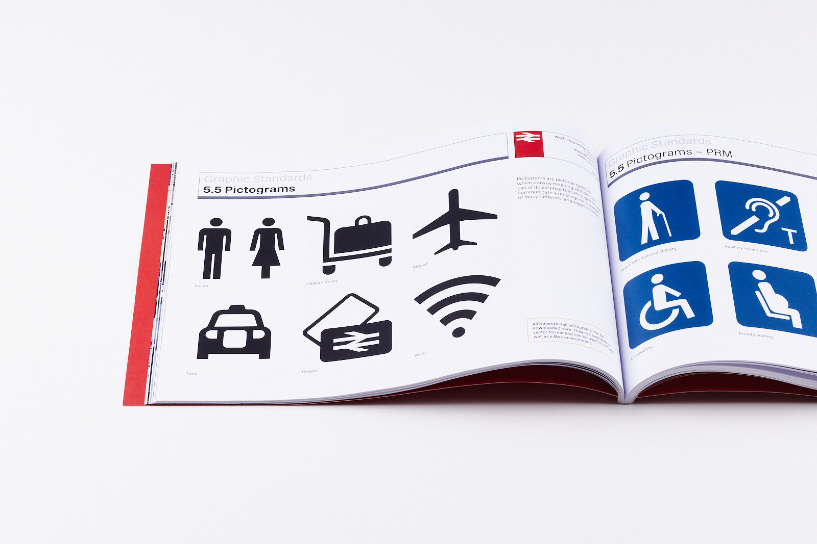
A comprehensive pictogram system for UK rail wayfinding - balancing ISO clarity with British character.
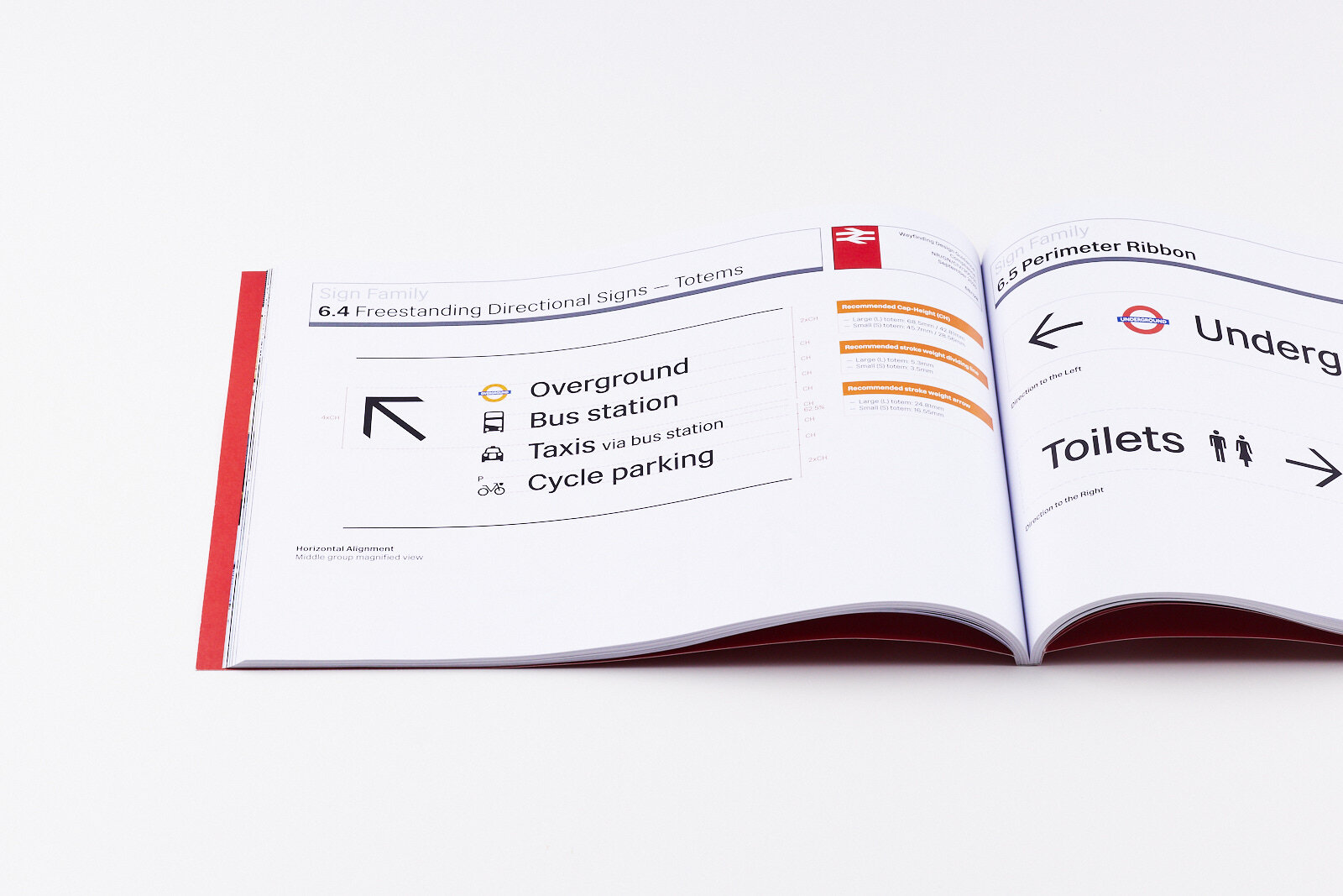
Led the redesign of Network Rail's pictogram system while at Spaceagency, working alongside Weston Williamson + Partners. The brief was to create a comprehensive set of pictograms for UK station wayfinding that would work across Network Rail's managed stations - from historic Victorian termini to modern transport hubs.
The project involved extensive stakeholder consultation, including sessions with the Built Environment Access Panel (BEAP) to ensure accessibility across diverse user needs.
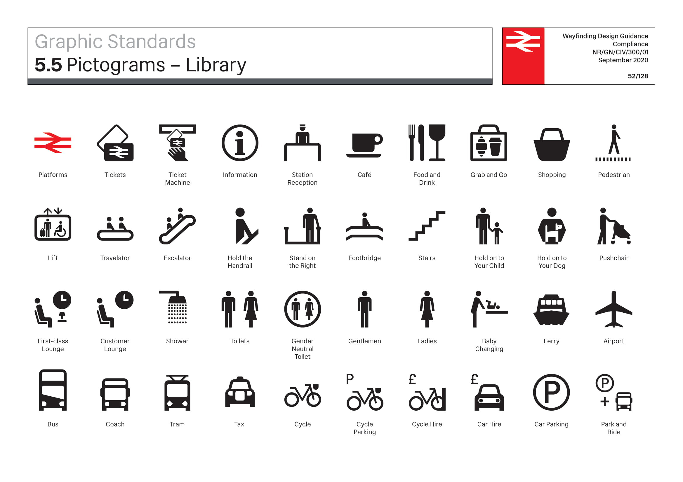
Network Rail Pictogram System
Design Criteria
01
ISO Adherence
The ISO 7001 standard represents decades of international testing. Rather than reinvent established conventions, we worked closely with ISO pictograms as a foundation - familiar to travellers worldwide.
02
Typographic Connection
The pictograms sit alongside Rail Alphabet 2 by Margaret Calvert and Henrik Kubel. We extracted formal elements from the letterforms and applied them across the icon set.
03
Modern Content
Existing pictograms contained anachronistic references. We updated icons like Lost Property - replacing the umbrella with a wheeled suitcase, phone, and keys.
04
Cultural Accuracy
The set references British identity: double-decker buses, black cab silhouettes, UK tram designs.
Design System
The "D" Shape
The signature element is derived from the bowl of Rail Alphabet's capital P. This form - a rectangle with one rounded end - appears across vehicles, cup handles, and luggage details.
Grid Construction
All pictograms are built on a 100x100 unit grid, with 2.5 units as the base module. Line weights, corner radii, and spacing are all multiples of 2.5.
Relative Scaling
Vehicles are scaled according to actual physical size - bus largest, taxi smallest. This aids recognition and avoids visual confusion.
Stakeholder Feedback
The BEAP panel review in January 2020 surfaced key concerns that shaped the final designs: strong preference for ISO-style pictograms due to universal familiarity, feedback that the proposed arrow was too thin, and that male/female pictograms needed clearer distinction.
Outcome
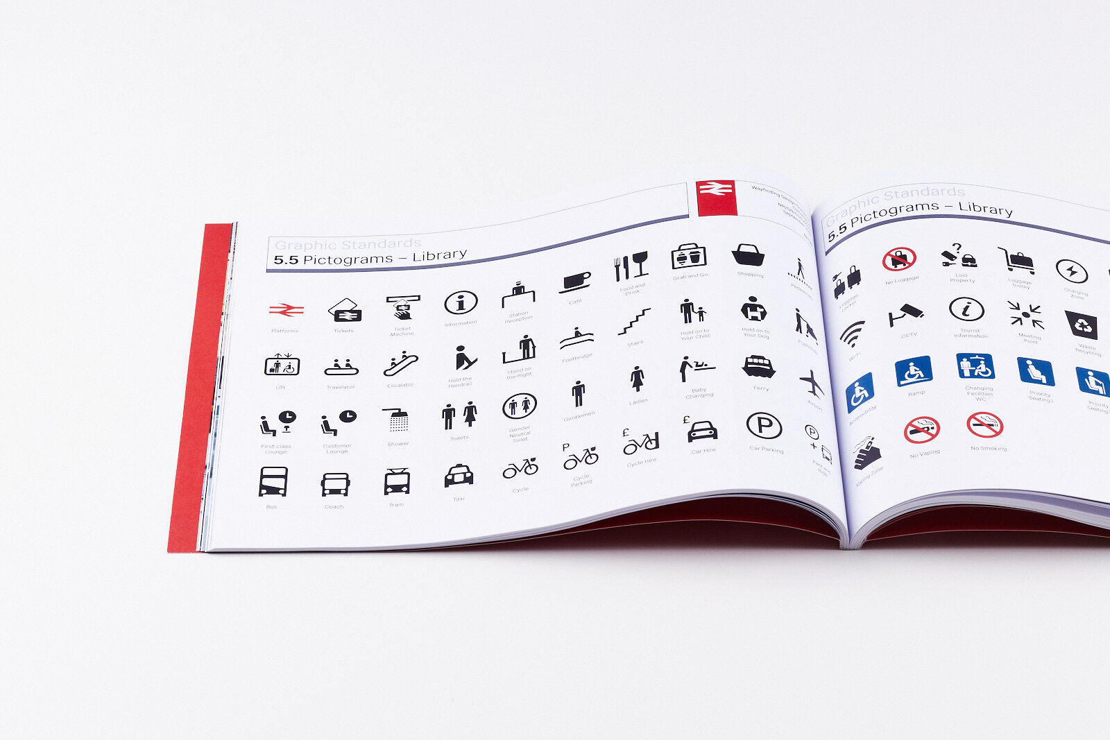
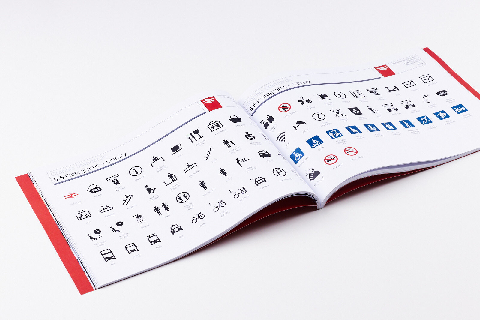
A complete pictogram system covering 85+ icons: transport modes, facilities, accessibility, wayfinding arrows, and operational signage. The system balances international legibility with British character, and connects visually to the Rail Alphabet typographic family.